A curious aspect of modern life is the urge we commonly display to look poorer than we are. I first noticed it in the 1980s, when something called the Hard Times look was featured loudly in The Face. On the cover of the magazine was a fellow in washed-out jeans with holes in them, and scruffy tattoos on his arms. He had probably woken up that morning in a Chelsea flat that Daddy bought for him.
And we are at it again with a vengeance. These days it is rare to encounter a pair of jeans that does not have holes in it. Or an arm that isn’t scrawled messily with numbers. We are surely the first society in the history of civilisation that is desperate to appear unclean, impoverished and unlucky.
Which brings me to arte povera, the Italian art movement that celebrates its 50th birthday this year. It was the art critic Germano Celant who christened it “poor art” — in 1967, when he organised a show in Genoa unveiling a group of mainly Italian artists who loosely fitted the definition. Italians are the last people on earth you would suspect of deliberately desiring scruffiness. But there it was. An art movement had appeared in Genoa devoted to worn-out textures, humble materials, broken moods and the aesthetics of entropy.
The only important gallery in Britain quixotically devoted to Italian art, the Estorick Collection, in north London, has taken it upon itself to remember arte povera and celebrate its birthday. It has gathered some of the original arte povera artists and paired them with their British counterparts. The aim is not only to compare and contrast their efforts, but also to recognise the fundamentals at stake in arte povera. What were its aims? Why did it do it?
Although the movement revered humble stuffs — there is art here made from dead snails, old boots, lumps of coal, cheap furry materials, discarded hairbrushes — it is clear from the moment you step in that an illusion of poverty was never the aim. Arte povera was most obviously concerned with transformation. Rather than make rich materials look poor, it sought to make poor materials look rich.
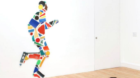
An early sight in the show is Tony Cragg’s Runner, a wall relief from 1985 in which a life-sized running figure has been splendidly created out of things found on the shore — plastic cups, a spade handle, a cigarette lighter. Another witty Brit, Jo Stockham, gives us a puffy cannon made from a patched pair of trousers. Cannons are always a bit penis-like, and some commentary on notions of masculinity was probably intended. But the joy here is in the amusing transformation of an old man’s callards into podgy artillery.
The show seems more regularly to be about British sculptural tastes than Italian ones. The Estorick Collection is a small building, and Italian arte povera was often big and sprawling, so the smallness of the Italian contribution may be down to practical issues. Yet even in this reduced form, the differences between the two aesthetics are tangible.
Mario Merz, to my mind the most archetypal of the Italian arte povera artists, is represented by two works. One is a grubby white cloth — an altar cloth? — on which is scrawled a charcoal spiral, at the centre of which is a dead snail. The other is a giant basket, shaped like a chimney, woven out of bendy willow. There is something harshly unglamorous about both, something aggressively plain that strikes a different note from the more charming British works around them.
You get it as well in Mario Ceroli’s I (1968). Presumably some kind of symbolic self-portrait, it features a circular iron cage, at the centre of which — where the heart should be — is a black heap of coal. Again, the industrial textures and gritty mood are strikingly humourless. If British arte povera delights in witty transformations, the Italian version smears us with oily hands and accuses us of capitalism.
In his 1967 catalogue introduction, Celant said he saw arte povera as a deliberate alternative to American pop art; as a European response to commercial values and American consumption. So the politics of the movement were tough and Spartist. Giuseppe Penone’s Study for Breath of Clay looks from the distance like a muddy footprint. And that’s pretty much what it looks like from close up as well. In fact, the splodge was carefully created with coffee stains and ink.
Although the Italians seem under-represented, there are just about enough of them to make their dark point, leaving the rest of the show free to enjoy the lighter British contributions. Richard Long, who somehow found his way into the first arte povera show, gives us a field covered with daisies in which two lines of flowers have been carefully removed to form a large cross in the grass. The resulting flag is called England.
Frankly, I could have done with more of both British wit and Italian grit. But an important connection has been noticed and celebrated.
Poor Art/Arte Povera: Italian Influences, British Responses, Estorick Collection, London N1, until Dec 17