Off the top of my head, I cannot think of an art style less fashionable at the moment than op art. We are living through an era when issues of identity and personal history dominate our aesthetics, and in those charged circumstances there is little reason for the cool geometry and inorganic colours of op art to find favour. Curators, the current power brokers of art, are uninterested in it because it offers so little storytelling space for them to occupy. Discovering a forgotten Romanian octogenarian in a biennale in Istanbul is a walk in the park compared with finding something insightful to say about the eye-popping maths of Victor Vasarely. So nothing is said.
Which is why Seurat to Riley: The Art of Perception, at the stately home of Compton Verney in Warwickshire, is a brave show, as well as a surprising one. When you turn the corner at Compton Verney — past the sheep fields, past the carp lake — you expect to encounter a Constable or a Gainsborough, but not the throbbing colour bars of Bridget Riley or the pulsing neon light walls of Liz West or Vasarely’s vibrating Rubik cubes.
So this is a genuinely independent display of curatorial thinking, involving a cheery disregard of what other parts of the art world are currently obsessing about. And I cannot tell you what a relief it is to encounter it. The art world badly needs a change of diet. It needs to stop obsessing about identity and to place some renewed trust in its eyes. In country terms, it needs to get out more. So, yes, Seurat to Riley has a revolutionary tang to it; and how totally, eccentrically, wonderfully British that this cocky redirection of modern thrusts should be taking place in a Georgian pile in Warwickshire filled with Robert Adam fireplaces and set in a landscape designed by Capability Brown. Mine’s a double GlenDronach, Percy.

Op art is, of course, a shortening of “optical art”, so we begin here with a diagram of the eye that seeks briefly to explain how it receives colour, and what it does with the information. Helpful. But not a pulse-raiser. It’s the agenda-setting face-off that comes next, between Georges Seurat, the great pointillist, and Bridget Riley, the great eye-buzzer, that ignites these proceedings, by making us sense immediately how colour works. What it does to the eyes. How the eyes respond to it.
The Seurat is a view of a French field in early June, when the poppies are poking through, borrowed from the Scottish National Gallery. It’s one of those paintings that seems not to have a focus and that leads the eye backwards and forwards across itself as you try to find something firm to settle on in the shimmering layers of green, dotted imprecisely with poppy reds. It’s a beautiful record of nothing special: a picture in which the act of looking is the point. What the artist shows us is mildly relevant, but more relevant still is the manner in which we recognise his offerings.
Something else that’s curious is the unexpected awareness you feel of time and its passing. Pictures with a firm subject can be grasped quickly, but Seurat’s field cannot. It demands to be experienced at length as a journey across a surface. Your eyes need to take a country stroll through the buzzing blobs of colour to complete what they are looking at.
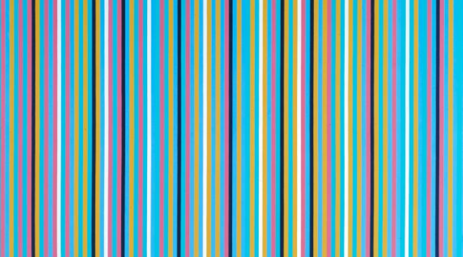
This glorious imprecision, the active way in which a picture needs to be experienced, is what Bridget Riley exploits in her contribution to the agenda-setting moment: a spangle of coloured stripes that seems never to settle in the large square in which they are presented. Thus the show’s opening moment makes two big points really well. That op art is an action art that involves the active participation of the viewer. And that what’s on the canvas is not the same thing as what you see.
Having got us up to speed on the dynamics of op art, the show winds its way through Compton Verney’s various galleries in cheerful clusters of summation. The chronology being followed is anything but rigid, but it does put developments in more or less the right order, while also unleashing moments of pure delight. Because there’s something excellently uncomplicated about the pleasures of op art. It’s the artistic equivalent of having an ice cream on a sunny day, or jumping on a waltzer at a fairground. Something about it — something that survives from the original appetites of the eye — connects us to the simple joy of living.
Nor does it turn out that op art was ever repetitive or mono-paced. There are countless ways to tickle the eye, and the show hops from one to t’other with a happy bounce in its step. On one wall, the visual puzzles of MC Escher feature op art at its most gothic, with a busy flight of geese that enter the picture as white geese and exit as black geese. Somewhere in the middle, there’s a transformation, but no amount of studious staring seems properly to answer where the change occurs.
On the opposite wall, the mighty American geometrist Josef Albers has pared down the action to the elementary interplay of parallel lines. All they do is crisscross the paper at various heights, but how firmly they divide the space into foregrounds and backgrounds, projections and recesses, plateaus and ascents. I presume this show never had it as an ambition to make obvious what a huge quiver of possibilities art is, or how skilled the best practitioners need to be to micromanage the optical possibilities, but it’s a point that keeps being made.
The 1960s were the golden age of op art. It cannot have been a coincidence that such optimistic times spawned such optimistic patterns. But even in the snap, crackle and pop of the Sixties there are lurches in mood. Peter Sedgley, op art pioneer, the forgotten giant of the movement, manages to make the throbbing of circles and the pulsing of colours feel like the rhythms of a galaxy. The op art component of his fabulous paintings simply doesn’t explain their cosmic force.
Riley, having played a part in the agenda-setting, keeps returning to progress the arguments. Unlike most op artists, there’s an emotional quality to her work, an ambition to set a mood — but to do it solely with the interplay of colour and lines. Thus the dazzling black-and-white pictures she produced in the 1960s vibrate with the spirit of the miniskirt and Mary Quant and the Hippy Hippy Shake. But her more recent stripings feel like a return to the outdoor thoughtfulness of Seurat: a garden mood, a sense of retirement. None of this is described. All of it is evoked.
Bravo, Compton Verney. You have put op art back on the map. And the fact that this revolutionary bit of curating takes place among the buttercups and the sheep runs adds a delightful frame to the experience.
Seurat to Riley, Compton Verney, until Oct 1